The ground is shaking for designers in general and specifically for digital designers. From the early 2000s through 2022, the UX field experienced steady, sustained growth. Investments yielded disproportionate returns, dramatically improving conversions and user satisfaction – wireframe sketches were worth their weight in gold. The pandemic accelerated this trend as society transformed — remote work and digital transformation drove UX hiring. At the peak, the internet was flooded with day-in-a-life videos where designers flexed their comfortable work ethics and six-figure salaries.
It was too easy. Then came the drop.
Rising interest rates and inflation, course correction from overhiring, and talent oversupply made UX design job listings drop 70% (UX research 71%) from early 2022 to 2023. Most prominently though: companies pivoting toward AI, automation, and cost-cutting. The market tightened and remains volatile.
As if that wasn’t enough, now, enter vibe coding: the promise is that anyone can create apps and websites from just natural language. Eliminating endless pixel pushing and time-consuming click-through mockups. As advertised by Rick Rubin, we can go from chat direct to code, no technical skill involved!
We fired up half a dozen trial accounts from key players in the game (so you don’t have to).
The prompt:
”Lifestyle magazine front page with one hero story and several smaller ones. Clean, minimalistic layout. Sophisticated typography.”
Google Stitch
Time: 1.00 mins
Screenshot reference: yes
Figma support: export
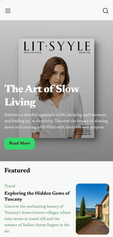
LIT·SYYLE. Google Stitch suggested a hero image featuring a print publication (seems to be some confusion regarding the magazine concept). It presented a mobile-only design and referred to a new chat for a desktop version. There is a convenient canvas interface for overviewing multiple pages. Very basic editing options are available, affecting the whole theme, not specific parts.
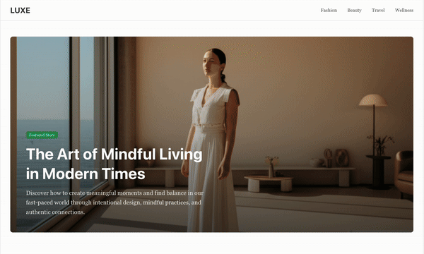
Claude Artifacts
Time: 1.30 mins
Screenshot reference: yes
Figma support: no
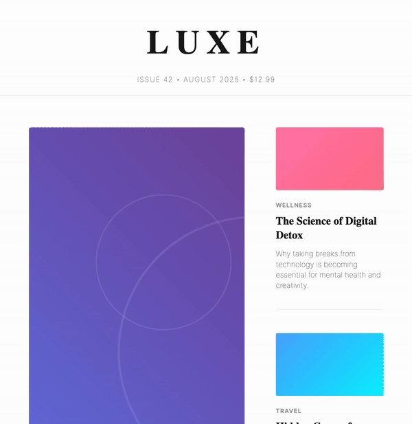
LUXE. Claude listed a design brief for review before executing on the prompt. After my green light, it whipped up an interesting solution with an extremely tall hero image. It showed real-time coding and provided a rationale for design decisions. There was no way of editing specific parts of the design outside of the chat and no intention of responsiveness.
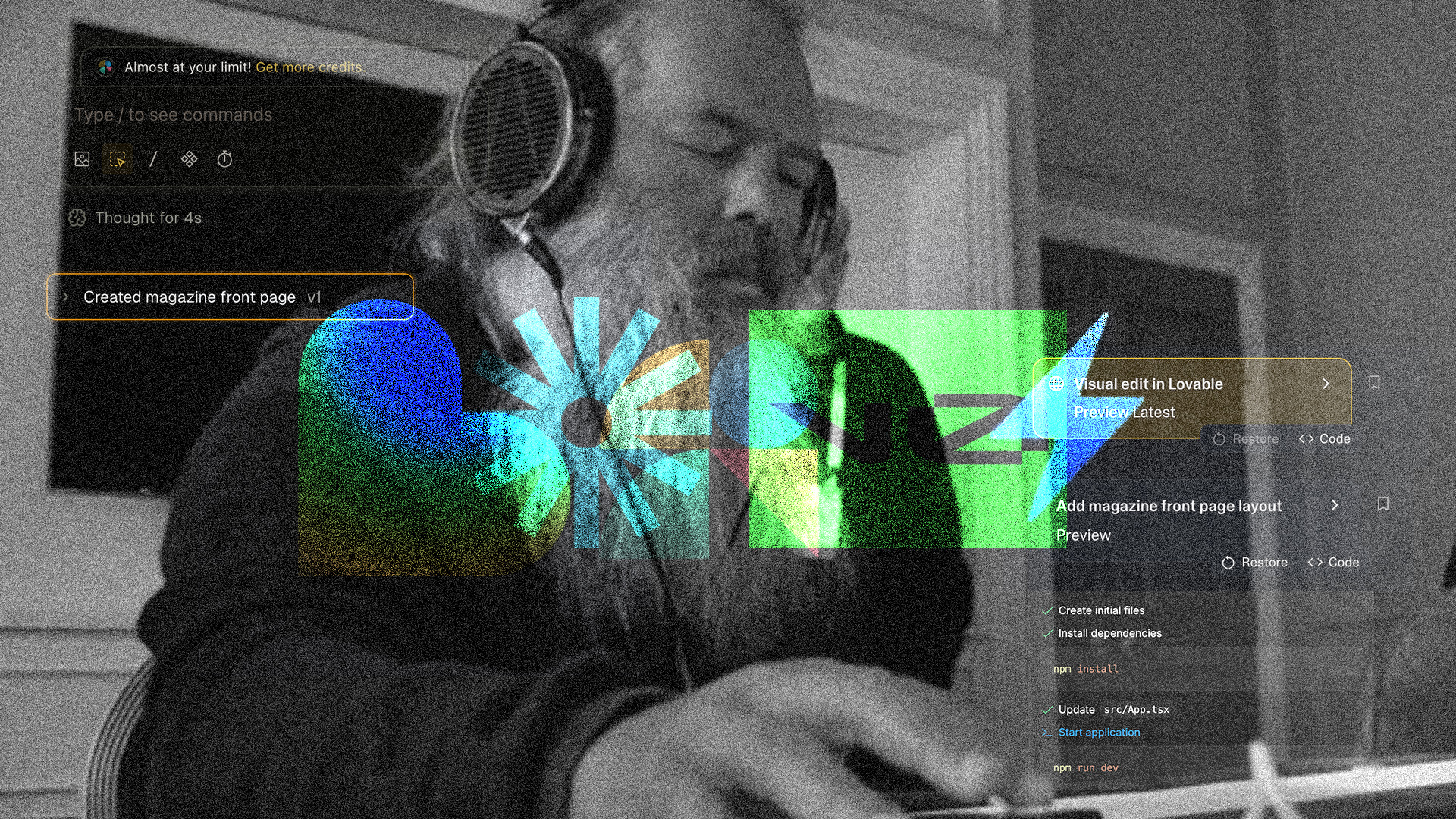
Lovable
Time: 2.30 mins
Screenshot reference: yes
Figma support: import
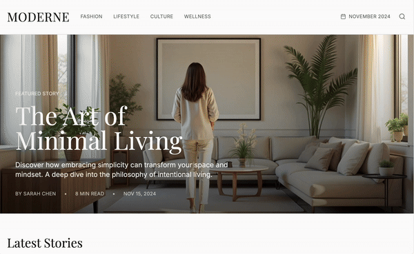
MODERNE. Lovable, possibly the next Swedish tech unicorn according to Forbes, showed me step-by-step progress in the chat dialogue. It provided a clear rationale for the design decisions along with suggested next actions. There are intuitive options for editing basic elements such as padding, font sizes, and colors.
V0
Time: 1.00 mins
Screenshot reference: yes
Figma support: import
LUXE. (Another one) V0 started with generating a design brief to itself. Provided a rationale that supported some, but not all, design decisions. The layout was responsive and smooth.
Bolt
Time: 1.00 mins
Screenshot reference: yes
Figma support: import

LUXE. (Seriously?)* In Bolt I used the ”enhance prompt” option and edited out the parts where it wanted to optimize for newsstands (confusion about the magazine concept again). Bolt provided reasoning and highly detailed rationale boosting its design decisions. The layout did not include any breakpoints for different screen sizes.
Magic Patterns
Time: 1.00 mins
Screenshot reference: yes
Figma support: export

ESSENCE. Magic Patterns created a design with responsiveness as a given. The most useful feature here is selecting specific areas to focus on in the chat.
The takeaway
Initial results are not very useful.
At best they looked like a website that you accidentally enter after typing in the wrong URL. To be fair, the input was weak. I wrote the prompt following the specificity and length of examples from the different apps, wanting it to reflect a person without any design training or experience.
Anyone could, after a lengthy chat, a mild migraine, and a bunch of AI credits, surely come up with a decent result. Let’s say 75% for the sake of the argument. ”Good enough” is what everybody will aim for. The final stretch to reach something remarkable is rooted in empathy (understanding the user), rationale, and above all: taste. The last 25% consists of classic designer qualities or ”the salsa to the chip,” as Professor Scott Galloway stated ahead of Figma’s IPO this summer.
The LLMs in my experiment all defined clean layout and sophisticated typography as some version of: ”two-font system combining serif elegance for headlines with clean sans-serif for body text” and ”set within a carefully structured grid system that maintains consistent 8px spacing throughout. The color palette is deliberately restrained.” Definitely not wrong, but what about the nuances in visual culture as it relates to the aspiring consumer?
The real unlock to fight the generic will be design system awareness. When the apps above can fully access clear design principles and reusable components, we can probably stop moving rectangles around on the screen. Oh what a relief! Our time as designers will be best spent first in the documentation layer, thinking deeply about the guiding rationales, and then — simply as taste arbiters.
* All apps naming the site Luxe also priced it at $12.95.