Severin works in the field of interior, product, and set design, styling, creative direction, content production, architectural photography, and more. As colour is always her main focus, she dares to call herself a colourist — you might know her as @teklan and she was recently listed as one of the most influential in the design industry by German AD — and runs her own studio since 2015.
Charlie Cosby joined Farrow & Ball at the tender age of 23 — ”I was like a kid in a sweet shop full of colours and patterns” — and has spent the last twelve years growing up with the brand.
With both working with it, it might seem unsurprising that they both do believe that colours can make life easier. Even more so now, when we’re spending more time at home and perhaps experience a rough period.
— ”Colour is light, and light is energy and energy is life,” as the colourist and alchemist Margrethe Odgaard once said. I couldn’t have said it better myself. Nuances are our natural heritage and studies are showing we still today feel most comfortable in those environments, Tekla Evelina Severin shares.
— During these times of turmoil, I think everyone yearns for the comfort that stronger, more nostalgic colours can bring to our homes. Putting a bit of thought into the colours we use in our homes can help us express ourselves, whether it’s to convey a sense of ease and familiarity or to create uniquely dramatic rooms with bolder ones, says Charlie Cosby, continuing,
— There’s also something in the way that certain colours can make us feel. If you want to feel grounded and comforted, as so many of us do right now, then something rich and warm or a deep and earthy colour from the natural world can have the desired effect. For a very soothing space, which you can relax in at the end of a long and stressful day, you could try something softer and paler.
Would you say that colours and how we should use them to affect our lives have become increasingly important? If so, how?
— I would say that, as many of us are spending much more time than usual at home, the colours we choose to surround ourselves with are probably more important than they’ve ever been. We know from colour psychology that certain shades tend to make us feel a certain way but, on an even more basic level than that, I think being surrounded by colours you truly love and spending time in rooms that make you feel happy, or comforted, or relaxed, or upbeat — depending on what you need — can have an enormous impact on your wellbeing, says Cosby.
Tekla Evelina Severin’s best tips for introducing colour to people’s mindset and homes is to think of colour as a dialogue.
— Colour is never absolute always relative, she shares. Think of colour like a wholeness, to just add an accent like a cushion or a flowerpot in a neutral white or grey space, just make that item pop. High contrasts and small accents can absolutely be fun, but it isn’t the best way if you want to surround yourself with colour. Instead, think of what mood and function you want to add to the specific room. And then think space and surfaces; floors, walls, curtains, and even ceilings — that’s what you need to create a wholeness of colour.
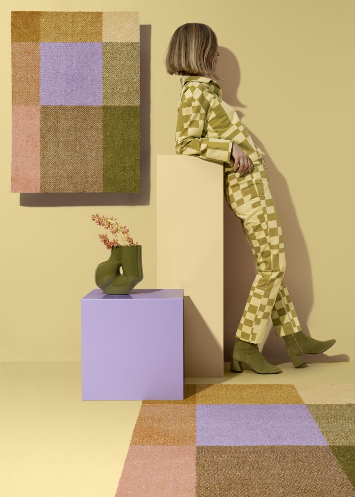
For Stockholm Design Week, Severin’s teamed up with Norwegian Heymat and was asked to interpret Kristine Five Melvear’s pattern Mix from 2016 — one of the brand’s first launched and most appreciated rugs.
— I wanted to create something mediative, yet sparkling, and inspired by gemstones, the Mediterranean, and 70’s colour schemes. I ended up with these set of what I call earthy pastels giving exactly this, I hope — and believe, she says.

This spring, Farrow & Ball launches The Nordic Edit together with Danish colour, textile, and wallpaper company Tapet-Cafe.
— It’s a selection of 24 colours from our current collection and Archive, which have been hand-picked by the brilliant Tapet-Cafe owner Jannik Martensen-Larsen. The goal of the edit was to capture the true colours of Scandinavia — not just whites and greys, but really bold, intense, striking colours that will encourage us out of our comfort zones, Charlie Cosby tells, continuing,
— There’s so much to be inspired by, whether it’s the red rooves in Copenhagen’s old town, or the greenery at Dyrehaven, or contemporary Scandinavian art, and I think Jannik’s done a fantastic job of capturing that variety in the colours he’s chosen. It’s a real invitation to be confident and creative with colour, and maybe to try out some fun new combinations that you hadn’t considered before. The beauty of the edit is that Tapet-Cafe has captured something for every home and personality. There are the more neutral shades, such as Strong White and Light Blue, for those who prefer a gentler scheme, and there are the bolder colours, including Mere Green and Chinese Blue, for those who prefer a deeper palette. All the colours will suit any home from a new-build to a Victorian terrace!